
Update on my bibliography of Professor Hoffmann’s Goodall booklets: I am basically finished with the proofreading. I have had to iron out one or two other little difficulties. I’ll probably basically check it over once or twice quickly — that sort of thing. I’ll probably submit it to the printer on Thursday or Friday.
Chas. Goodall and Son’s naming of their “Historic” cards is a little confusing. But unless there is some sort of a qualifier (as in “Historic Shakespeare Playing Cards”), the term “Historic” (with reference to Goodall cards) probably applies to the cards wherein the court cards portray “the Royal Costumes of four reigns in English History,” to quote from one of the advertisements.
Below is a scan showing Professor Hoffmann’s Rubicon Bézique (top), 1895, and his Ecarté, also 1895. An example of an advertisement for each pack is shown.

There are a number of discussions of Goodall’s Historic Playing Cards on the internet, but the ones I have seen leave me with various questions. The most methodical treatment of the packs (as far as I am aware) is on page 26a and 26b of Mike Goodall’s Chas. Goodall & Son: The Family and the Firm 1820-1922.
Mike’s book breaks them down into eight basic back-designs (actually, under “H.8” there are two different backs), but there are variations within several of those, and in all there are mentioned over a dozen variations.
But the possible complexities are almost endless, and it seems as though one would need to have access to many decks in order to hope to figure out all of the possible variations.
Anyway, I want to draw attention to two packs in my possession. They would generally fall under the “H.7” heading in Mike’s book mentioned above. Here is a scan of one card from each pack:
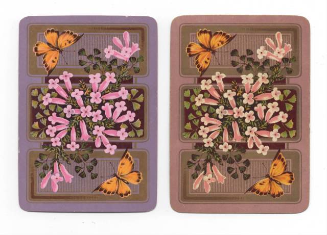
Based on that scan alone, it is pretty clear that the two backs are different. The one on the left is more purple, and the one on the right is more chocolate.
Some might say that’s a pretty silly distinction. (Some, not me.) But there are other differences, and I suspect that the most obvious is the fact that the flowers on the left are solid pink (in different shades), while the flowers on the right include a lot of white.
That is probably more clear in the following detail.

Below is shown a different detail:

This may leave one with the question of whether there are differences between the two packs, with respect to the “fronts” of the cards. I hope to get into that topic in my next post.
–Tom Sawyer
August 1, 2017
